P/Q scatter plot
| P/Q scatter plot |

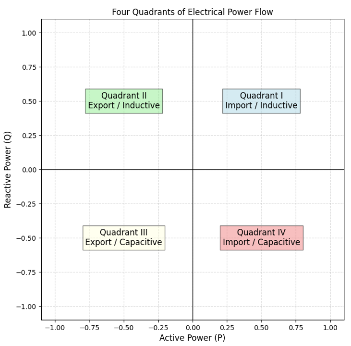
The P/Q scatter plot is a specialised chart used in electrical engineering that illustrates the relationship between active power P and reactive power Q in an X/Y coordinate system. Pairs of values from a given time range can thus be analysed in the four quadrants.
NOTICE

Only one metering point containing the P+ and Q+ measured variables may be selected. The P- and Q- measured variables are optional.
The measured variables are automatically assigned once the metering point has been selected.
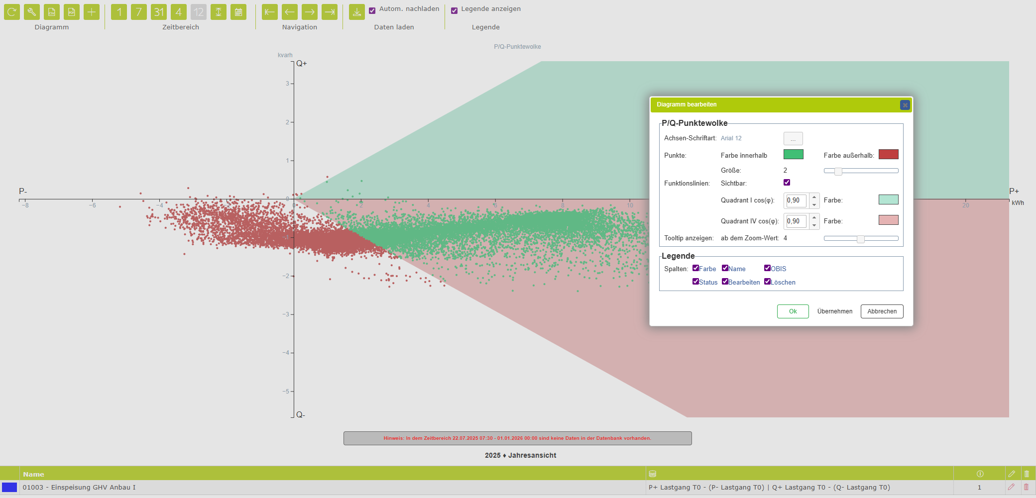
Chart properties
Axis font | Selection – Select the colour, font and size for the axis labels. |
Points |
|
Colour | Colour selection – If the “Function lines visible” option is disabled, this property determines the display colour of the individual points. |
Colour inside | Colour selection – If the “Function lines visible” option is enabled, this property determines the display colour of the individual points within the permitted range. |
Colour outside | Colour selection – If the “Function lines visible” option is enabled, this property determines the display colour of individual points outside the permitted range. |
Size | Number – 0.1 to 10 – Allows you to adjust the point size. |
Function line |
|
Visible | Yes / No – Enables or disables the permitted cos phi range. |
Quadrant I |
|
Quadrant IV |
|
Show tooltip from zoom level | Tooltips showing the values can be displayed when the mouse hovers over a data point. However, this can be distracting when the zoom level is high and there are a great many data points. Select a suitable value here as required. |
Legend | Specifies which columns are displayed in the chart legend. |
Toolbar
Chart | ||
| Refresh | Reloads the data from the database and updates the chart. Please note: any unsaved changes will be overwritten by the most recent version stored in the database. |
| CSV download | Generates a CSV data file and enables the browser’s download/save function. |
| Properties | Opens a dialog box containing the chart properties. Here, you can, among other things, show or hide the columns in the legend. |
Display (not available for all chart types) | ||
| Time chart view | Values for the current time range are displayed in a level (x)–time (y) view. Depending on the measured variable, the level can be displayed as a line, a bar or point. |
| Value table view | The values for the current time range are displayed as a table. |
| Frequency distribution view | Values in the current time range are sorted by value rather than chronologically by time. |
Time range | ||
| Day view | The time range is scaled to one day. |
| Week view | The time range is scaled to one week. |
| Month view | The time range is scaled to one month. |
| Quarter view | The time range is scaled to a quarter. |
| Year view | The time range is scaled to one year. |
| Display entire time range | The entire time range available in the database is loaded and the view is scaled accordingly. |
| Custom time range | The display range can be customised by specifying a start and end date. |
Navigation | ||
| Go to the first record | The first available data is loaded and displayed within the currently selected time range. |
| Go to the previous range | Displays the previous range. |
| Go to the next range | Displays the next time range. |
| Go to the last record | The most recent available data are loaded and displayed within the currently selected time range. |
Show legend | ||
Allows you to show or hide the legend. | ||


