Level-time chart
| Level-time chart |

The level-time chart can be used to plot and analyse any data over time using up to four value axes. Convenient features such as pan and zoom, along with a wide range of display options, provide the user with a powerful tool.
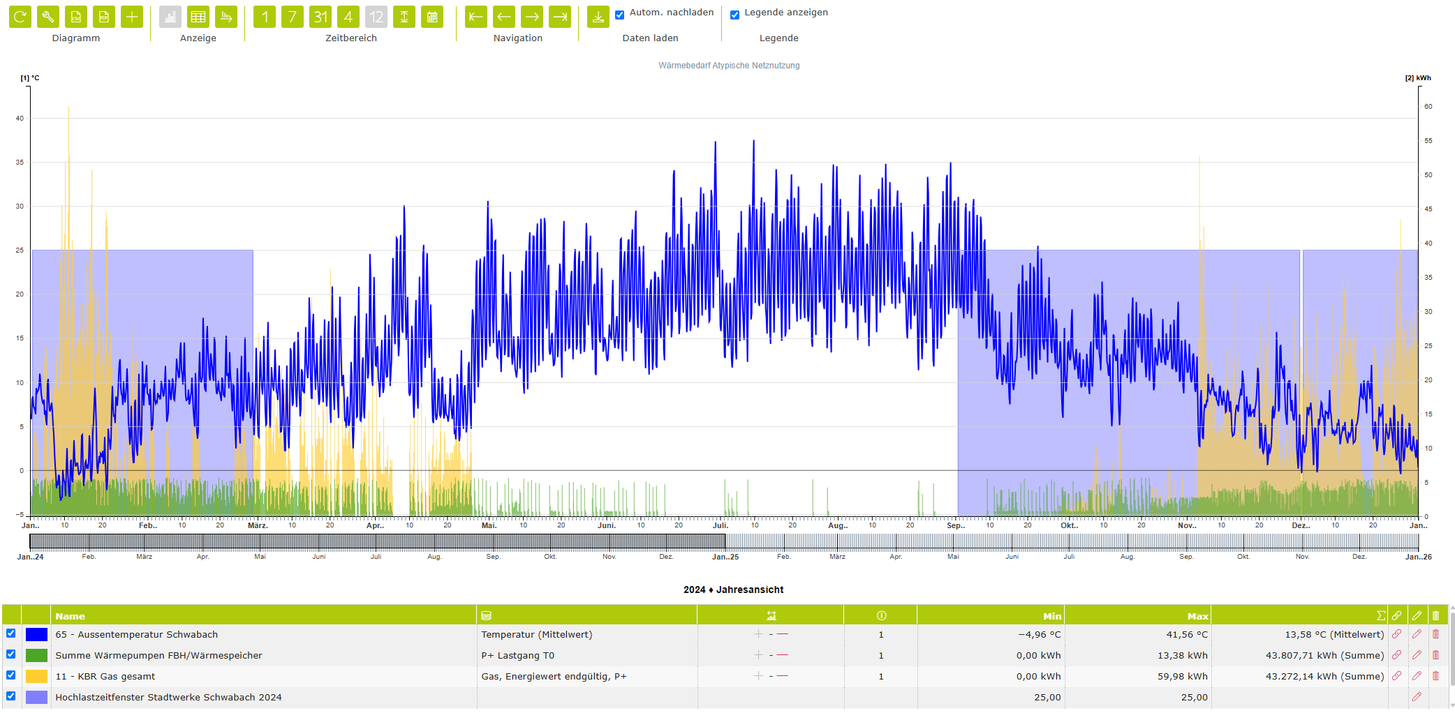
Chart properties
Legend | Specifies which columns are displayed in the chart legend. |
Toolbar
Chart | ||
| Refresh | Reloads the data from the database and updates the chart. Please note: any unsaved changes will be overwritten by the most recent version stored in the database. |
| CSV download | Generates a CSV data file and enables the browser’s download/save function. |
| Properties | Opens a dialog box containing the chart properties. Here, you can, among other things, show or hide the columns in the legend. |
Display (not available for all chart types) | ||
| Time chart view | Values for the current time range are displayed in a level (x)–time (y) view. Depending on the measured variable, the level can be displayed as a line, a bar or point. |
| Value table view | The values for the current time range are displayed as a table. |
| Frequency distribution view | Values in the current time range are sorted by value rather than chronologically by time. |
Time range | ||
| Day view | The time range is scaled to one day. |
| Week view | The time range is scaled to one week. |
| Month view | The time range is scaled to one month. |
| Quarter view | The time range is scaled to a quarter. |
| Year view | The time range is scaled to one year. |
| Display entire time range | The entire time range available in the database is loaded and the view is scaled accordingly. |
| Custom time range | The display range can be customised by specifying a start and end date. |
Navigation | ||
| Go to the first record | The first available data is loaded and displayed within the currently selected time range. |
| Go to the previous range | Displays the previous range. |
| Go to the next range | Displays the next time range. |
| Go to the last record | The most recent available data are loaded and displayed within the currently selected time range. |
Show legend | ||
Allows you to show or hide the legend. | ||


Navigation on the value axis
Each measured variable is displayed on a scale corresponding to the unit. Up to four independent value scales can be defined per chart. Right-clicking on the relevant scale allows you to switch between automatic and manual scaling. In automatic mode, the highest value loaded from the database determines the upper scale limit. By holding down the left mouse button, you can move the scale range up or down. By using the mouse scroll wheel within the scale area, you can also zoom on the value axis.
Time aggregation
Each channel can aggregate the retrieved data by time on an individual basis. To this end, the aggregation function defined for the respective OBIS measured variable is used by default. However, the default aggregation function for the measured variable can also be overridden individually for this channel in this diagram.
Channel properties
Name/Designation/Title | A meaningful text entry. The designation is used for identification and search purposes and can be changed at any time. |
Enabled | Yes / No – Enables or disables the object. |
Display measured value information | Yes/No – Additional information can be stored for each record. If information is stored for a record, an indicator can be displayed next to that value in the chart. Clicking on this indicator displays the full measured value information. |
Colour | Selection – Allows you to customise the colour for the channel. |
Rank | Number – Allows you to set the order of the channels. The order can be crucial when elements overlap. This property can also be changed by dragging the channel with the mouse. The first channel is ranked 0, and so on. |
Static lines
Y-axis
Type