Heat map chart
| Heat map |

In a heat map, the data is displayed similarly to a thermal imaging camera or, alternatively, using a colour scale. In a two-dimensional display, different time intervals can be used for the X and Y axes.
- If multiple measurement channels are used, their values can be added together or subtracted from one another.
- If a time range wider than that displayed is selected, the data will be processed in accordance with its OBIS function (sum, average, maximum, etc.).
- There are several time axes to choose from:
- Year: 12 months / 31 days
- Year: 53 weeks / 7 days
- Quarter: 3 months / 31 days
- Month: 31 days / 24 hours
- Month: 31 days / 96 periods
- Week: 7 days / 24 hours
- Week: 7 days / 96 periods
- Day: 24 hours / 4 periods
- Day: 24 hours / 60 minutes
- There are several colour palettes available for the display.
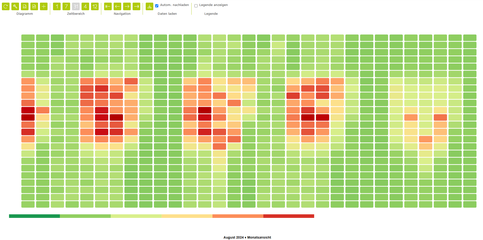
Chart properties
Colour legend visible | Yes / No – Optional display of the colour legend. |
Position | Selection – Specify the position of the colour legend. Possible positions are below or above |
Axis scaling | Selection – Depending on the time range selected (day, week, month…)
|
Colour scheme | Selection – Choose a predefined colour scheme for mapping the value ranges to colours. |
Legend | Specifies which columns are displayed in the chart legend. |
Toolbar
Chart | ||
| Refresh | Reloads the data from the database and updates the chart. Please note: any unsaved changes will be overwritten by the most recent version stored in the database. |
| CSV download | Generates a CSV data file and enables the browser’s download/save function. |
| Properties | Opens a dialog box containing the chart properties. Here, you can, among other things, show or hide the columns in the legend. |
Display (not available for all chart types) | ||
| Time chart view | Values for the current time range are displayed in a level (x)–time (y) view. Depending on the measured variable, the level can be displayed as a line, a bar or point. |
| Value table view | The values for the current time range are displayed as a table. |
| Frequency distribution view | Values in the current time range are sorted by value rather than chronologically by time. |
Time range | ||
| Day view | The time range is scaled to one day. |
| Week view | The time range is scaled to one week. |
| Month view | The time range is scaled to one month. |
| Quarter view | The time range is scaled to a quarter. |
| Year view | The time range is scaled to one year. |
| Display entire time range | The entire time range available in the database is loaded and the view is scaled accordingly. |
| Custom time range | The display range can be customised by specifying a start and end date. |
Navigation | ||
| Go to the first record | The first available data is loaded and displayed within the currently selected time range. |
| Go to the previous range | Displays the previous range. |
| Go to the next range | Displays the next time range. |
| Go to the last record | The most recent available data are loaded and displayed within the currently selected time range. |
Show legend | ||
Allows you to show or hide the legend. | ||


Channel properties
Name/Designation/Title | A meaningful text entry. The designation is used for identification and search purposes and can be changed at any time. |
Enabled | Yes / No – Enables or disables the object. |
Colour | Selection – Allows you to customise the colour for the channel. |
Rank | Number – Allows you to set the order of the channels. The order can be crucial when elements overlap. This property can also be changed by dragging the channel with the mouse. The first channel is ranked 0, and so on. |
Labels | The labels can be customised for each channel (circular, pie or doughnut segment):
|
Show value | Yes/No – Optional display of values in the chart. |
Font | Selection – Choose the font, size and colour for the value display. |