Regression analysis
| Regression analysis |

Regression analysis is a static tool used to identify trends or outliers graphically. Two measured channels that are directly related to one another are required, for example electricity (kWh) and production quantity (units). Based on their temporal assignment, a point is generated in the coordinate system for each value pair. All data points (pairs of values) for a given time range can then be plotted on a chart.
For further analysis, a line can be generated using a selected statistical function. Seven different statistical methods are currently available. Using the line, corresponding values on the second axis can be derived for theoretical values on the first axis. Optionally, an R² value indicating the goodness of fit of the selected statistical function can be displayed.
- Any measured channels (metering point / OBIS) can be related to one another.
- Seven different statistical functions to choose from (linear, quadratic, polynomial, exponential, logarithmic, power, Loess)
- The colour and line thickness of the regression line can be selected.
- Point size can be set freely.
- The R² goodness-of-fit value can be displayed.
- All standard chart functions (selecting a time range, PDF printing, use as a favourite, and much more) are available.
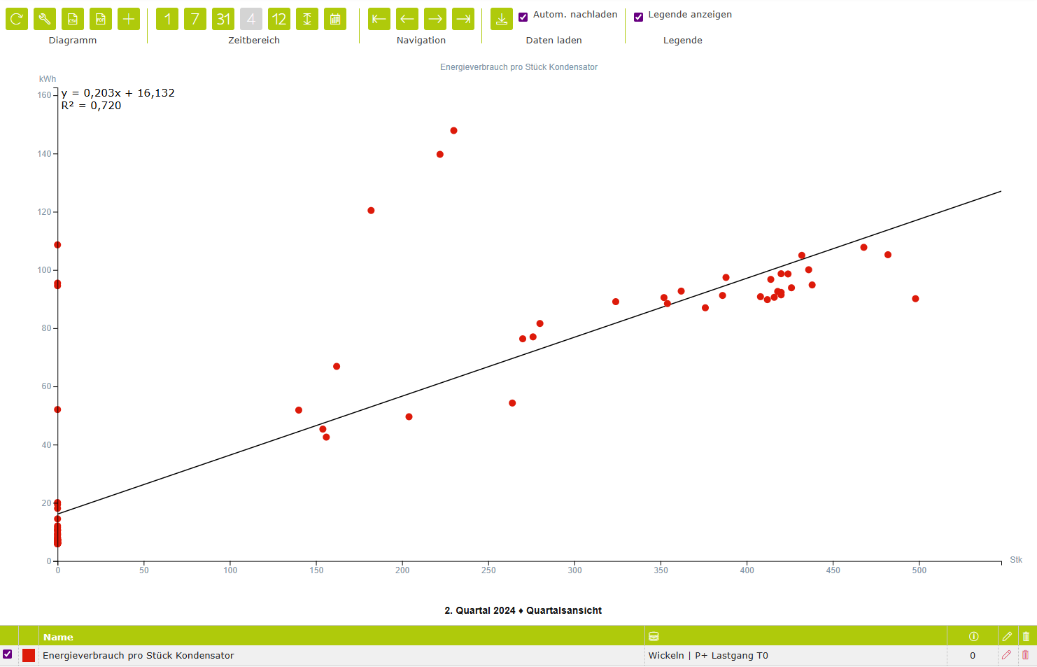
Chart properties
Axis font | Selection – Select the colour, font and size for the axis labels. |
Legend | Specifies which columns are displayed in the chart legend. |
Toolbar
Chart | ||
| Refresh | Reloads the data from the database and updates the chart. Please note: any unsaved changes will be overwritten by the most recent version stored in the database. |
| CSV download | Generates a CSV data file and enables the browser’s download/save function. |
| Properties | Opens a dialog box containing the chart properties. Here, you can, among other things, show or hide the columns in the legend. |
Display (not available for all chart types) | ||
| Time chart view | Values for the current time range are displayed in a level (x)–time (y) view. Depending on the measured variable, the level can be displayed as a line, a bar or point. |
| Value table view | The values for the current time range are displayed as a table. |
| Frequency distribution view | Values in the current time range are sorted by value rather than chronologically by time. |
Time range | ||
| Day view | The time range is scaled to one day. |
| Week view | The time range is scaled to one week. |
| Month view | The time range is scaled to one month. |
| Quarter view | The time range is scaled to a quarter. |
| Year view | The time range is scaled to one year. |
| Display entire time range | The entire time range available in the database is loaded and the view is scaled accordingly. |
| Custom time range | The display range can be customised by specifying a start and end date. |
Navigation | ||
| Go to the first record | The first available data is loaded and displayed within the currently selected time range. |
| Go to the previous range | Displays the previous range. |
| Go to the next range | Displays the next time range. |
| Go to the last record | The most recent available data are loaded and displayed within the currently selected time range. |
Show legend | ||
Allows you to show or hide the legend. | ||


Channel properties
Name/Designation/Title | A meaningful text entry. The designation is used for identification and search purposes and can be changed at any time. |
Enabled | Yes / No – Enables or disables the object. |
Colour | Selection – Allows you to customise the colour for the channel. |
Rank | Number – Allows you to set the order of the channels. The order can be crucial when elements overlap. This property can also be changed by dragging the channel with the mouse. The first channel is ranked 0, and so on. |
Point size | Number 1–100 – Allows you to set the size of each data point individually. |
X-axis | Display – Shows the currently defined measured variable with the X-axis assignment. |
Y-axis | Display – Shows the currently defined measured variable with the Y-axis assignment. |
Swap axes | Action – Swaps the current X and Y axis assignments. |
Show tooltip | Yes/No – A tooltip showing the value, time and status can be displayed for each data point when the mouse hovers over it. When displaying larger time ranges with a large number of data points, it is advisable not to enable this option. |
Show regression | Yes/No – The regression line and result derived from the data points, time range and regression function can optionally be displayed on the chart. |
Colour | Font colour selection – The font and font size are set by the system. |
Line thickness | Number 1 – 20 – Defines the thickness of the statistical regression line. |
Regression function | Selection –
|
Show R² | Selection Yes / No – The R² value (coefficient of determination) is a key measure in regression analysis. It indicates how well a regression model explains the variation in the data – in other words, how well the regression function fits the observed data.
|
Show formula | Selection Yes / No – The selected function is displayed as a formula in the chart. |
Font size | Number – Defines the font size for R² and the formula. |
Position | Selection – Defines the position for R² and the formula
|